Google Sans: The Font About to Conquer the Web
We assume corporate branding requires locking your proprietary font inside a strict walled garden. Google just open sourced their flagship typeface and made it the default in Docs to quietly dictate the visual aesthetic of the entire internet.
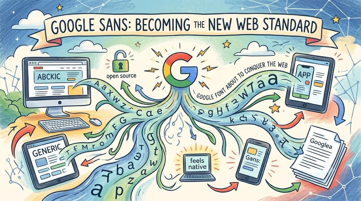
By surrendering their exclusive corporate typeface Google is executing a brilliant strategy to make every third party application feel like a native Pixel experience.
Inspiration: Analyzing the recent decision to open source Google Sans and replace Arial as the default font in Google Docs. Realizing this is a calculated distribution play designed to monopolize digital typography and make Google generated fonts the industry standard.
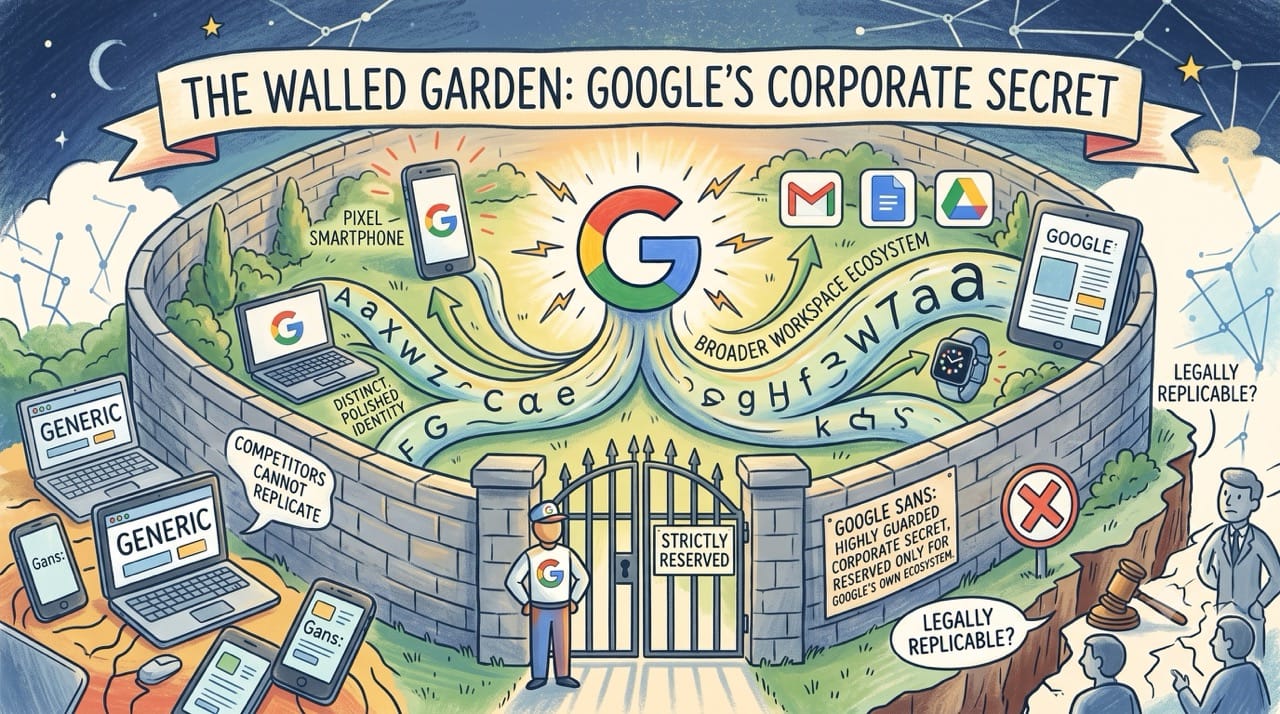
The Walled Garden
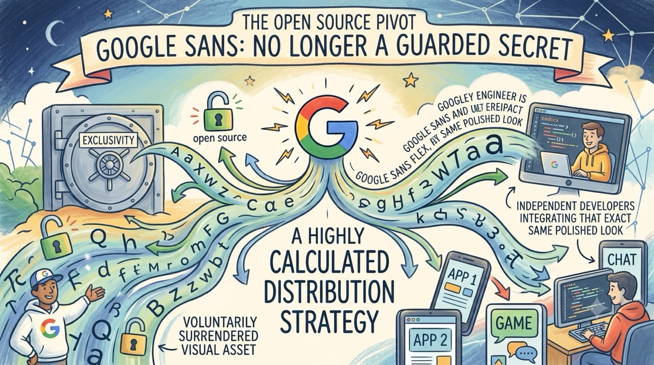
For years Google treated their custom typeface as a highly guarded corporate secret.
Google Sans was strictly reserved for their own premium hardware and first party applications.
It served as the invisible glue connecting the Pixel smartphone with the broader Google Workspace ecosystem.
This exclusivity gave their products a distinct and polished identity that competitors could not legally replicate.
The Open Source Pivot
The company recently executed a fascinating reversal by officially open sourcing Google Sans and Google Sans Flex.
They voluntarily surrendered the exact visual asset that made their brand feel uniquely premium.
This initially looks like a loss of corporate control but it is actually a highly calculated distribution strategy.
By making the font freely available they are inviting independent developers to integrate that exact same polished look into third party software.
The Docs Catalyst
The true genius of this distribution strategy lies in a seemingly boring software update.
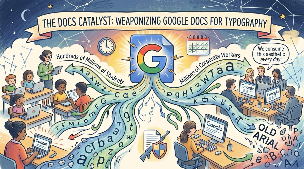
Google recently replaced Arial as the default font across the entire Google Docs platform.
This single update forces hundreds of millions of students and corporate workers to consume the Google Sans aesthetic every single day.
They are weaponizing their most popular productivity tool to build incredible consumer familiarity with their typography.
The Familiarity Loop
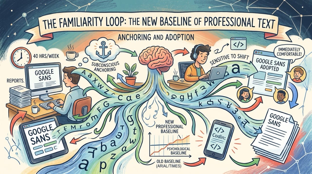
When users spend forty hours a week typing reports in a specific font they subconsciously anchor to that visual style.
It becomes the new psychological baseline for what professional text is supposed to look like.
Independent software developers are highly sensitive to this shifting consumer preference. They will quickly adopt Google Sans for their own applications simply because it makes their users feel immediately comfortable.
The Design Standard
We frequently talk about technology giants monopolizing data or search traffic.
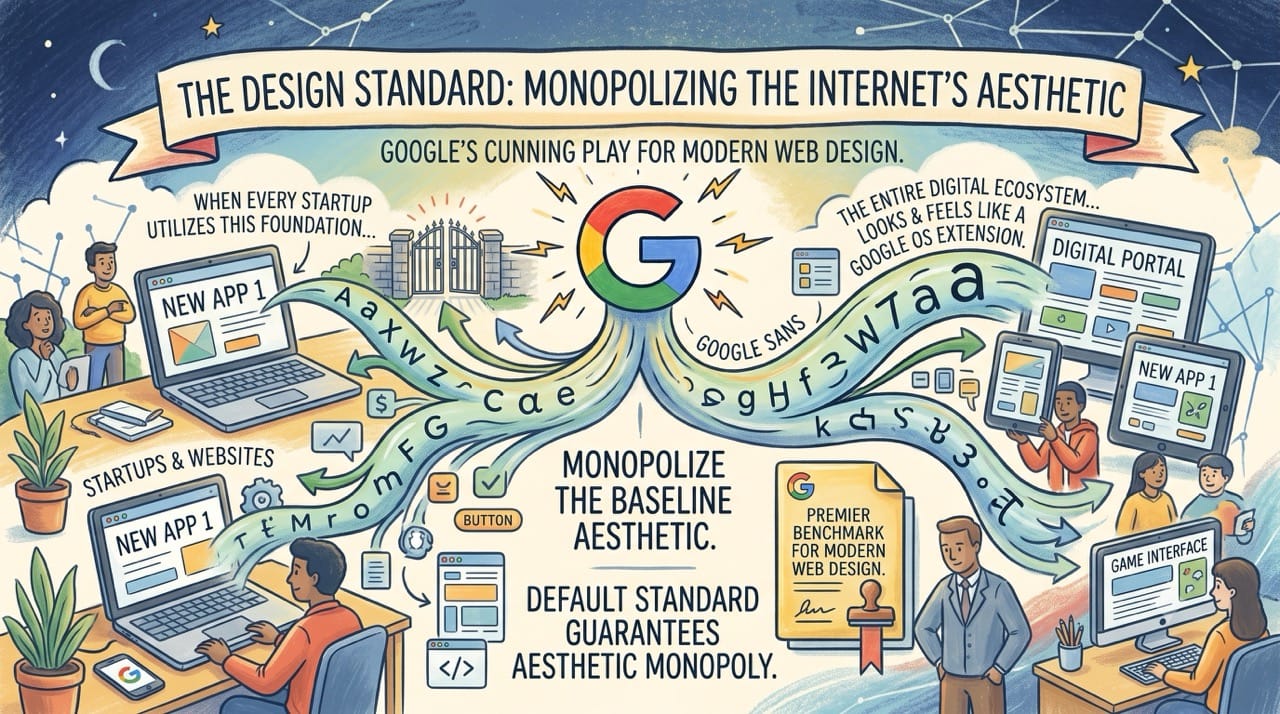
Google is currently executing a brilliant campaign to completely monopolize the baseline aesthetic of the internet.
By making their custom fonts the default standard they guarantee that Google generated typography stands out as the premier benchmark for modern web design.
When every startup utilizes this open source foundation the entire digital ecosystem slowly starts to look and feel like an extension of the Google operating system.
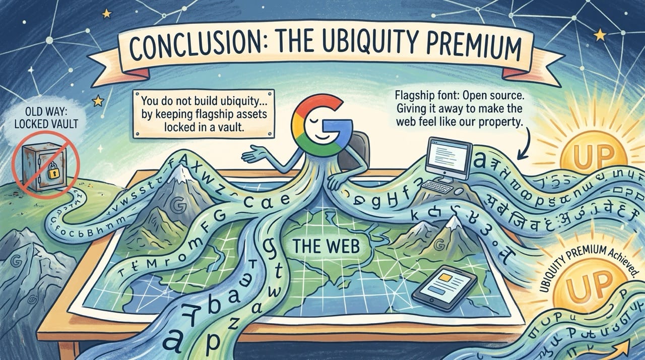
Conclusion: The Ubiquity Premium
You do not build a ubiquitous brand by keeping your best design assets locked in a corporate vault.
Google realized that giving away their flagship font for free is the easiest way to make the rest of the web feel like their property.